This series explores the early history of browsers for mobile phones to gain valuable insights and spark new innovation for the future. In “Part 1: Internet browsers on mobile phones, a brief history”, Igor Netto explains the very beginning of mobile browsers and how WAP and iMode pioneered a new future for us all. In this blog, he takes us on the next stop in this journey, how mobile browsers rose to popularity and the limitations they had to overcome. Come back for the conclusion of the series “Part 3: How mobile is overtaking desktop” and how this will shape the future of the internet on our mobile devices.
Eve of the 21st century, the rise of open mobile platforms
With the 21st century approaching we started having faster connections and better hardware that allowed “proper” internet on mobile phones. It also allowed the rise of a large number of mobile platforms (mobile operating systems).
Today we are all familiar with mobile operating systems such as Android and iOS but all mobile phones have an operating system (OS), including feature phones. Features phones (which were the only phones at the time) use RTOS (real-time operating system). RTOS are highly optimized to run on very constrained hardware (slow CPU, low memory, limited storage, etc); by their own nature all RTOS are different from each other with custom APIs, filesystem, etc.
In this scenario it’s not possible for third-party developers to develop native applications for those OSes: this is why J2ME (aka Java Platform, Micro Edition) was created. J2ME is a Java ASE platform that allows users to install and run Java applications on top of RTOS paving the way for third-party browsers for mobile phones. Popular browsers for J2ME include Bolt, Opera Mini, Maxthon Browser, Teashark, UC Browser, nWeb (by Novarra). These browsers still had to deal with the limitations of the hardware they were running on: it wasn’t possible to directly access and render normal web pages.
At the same time early smartphones and smartphone OSes emerged: Limo, Bada, Meego, Tizen, Sailfish, Windows CE (later Pocket PC and later on Windows Mobile), and Symbian (S60 and UIQ). These platforms were equivalent to modern smartphone OSes: they allow native third-party applications including full fledged internet browsers. Like Android and iOS today those platforms had a default browser included, sometimes a third-party browser (Opera on Symbian UIQ and many Windows mobile handsets) or their own browser (Nokia xPress for S60 and Pocket Internet Explorer for Microsoft)
Palm, famous for their PDAs, created an OS in which the browser was the OS itself: WebOS.
Mozilla followed suit with Firefox OS (now defunct and resurrected as KaiOS). WebOS like Firefox OS didn’t gain traction on mobile but, after being acquired by LGE, became the OS in SmartTVs from LG.
Hardware limitations
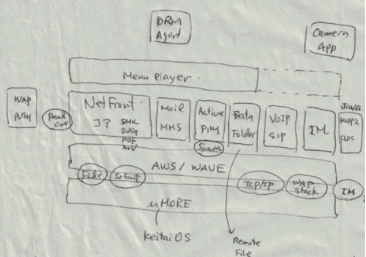
Kamada-san has a very good list of the factors affecting browsing experience and design on most mobile handsets at that time (pre-2000).
- Phone-call first; Real-time processing
The most important function of a mobile phone is the “phone” function: once a call comes every other task shall be suspended, browsing included. - Fast boot
Phones (and any application on them) has to start fast; users are not expected to wait for a long time. - Low power consumption
Battery life is critical for mobile handsets, and the browser has to be very careful to suspend operations when not in use, and be very conservative in how operations are run. - Small memory and low power CPUs
Mobile phones in 1997 had only very small hardware resources. The typical device in those days had a 16-bit CPU (1-2 MHz) and 256 Kbytes memory. Browsers had to be designed and implemented to be as compact as possible by componentizing it and doing every effort to make it small.
“Componentizing” allowed the OS to load only parts of the browser at each time. - Local Web Applications
The browser can be used to build the UI and power the functions of other applications/services in the phone. Email was one of the many applications that was built reusing the browser components.

Architecture of Mobile Web Browser, courtesy of Kamada-san
The dawn of the new millennium brought faster data connections (GPRS and UTMS) and the first smartphones, but the challenges weren’t very different.
Let's start with the specifications of a 2001-2002 vintage smartphone: Nokia 7650.
32-bit RISC CPU, based on ARM-9 series, a 104 MHz CPU clock, 4 MB RAM and 4MB of storage for the user. Screen resolution of 176 x 208 pixels, no touch-screen (keypad navigation). A big jump compared to the headsets of 5 years prior but still risible compared to what we have today.
The main limitations:
- RAM: 4MB is not enough to run a browser and have a full web page (made for PC) in memory; for comparison Google Chrome today requires a minimum of 8GB RAM on Android 10.
- Screen size: pages made for desktop computers counted to screen resolutions (800 × 600 as bare minimum). Users had to do a lot of scrolling to use the full webpage, while seeing only a small portion of it.
- Interaction: most pages were made to be used with a mouse, phones didn’t have a mouse or a touch screen. It was very cumbersome to navigate the pages and select/click items.
- Slow data: GPRS was the best connection you could have, and the best speed you could achieve was 48kbs: to download 1MB it would take 2 minutes 54 seconds.
To overcome RAM limitations, browsers had to split pages and render them by parts. Browsers had to be very “smart” to balance memory consumption with speed of downloading (remember the slow data connection). They were also resizing images to smaller resolutions (discarding the originals after processing), reformatting various HTML elements to consume less memory and many other clever solutions.
To overcome screen size Nokia introduced a mini map: while scrolling the page you could see a “map” of the full page with the area that was currently visualized.
Opera introduced Small Screen Rendering: the browser was reformatting the page to have only vertical scrolling and discarding unnecessary parts. For example instead of presenting table content in columns and rows, tables were reformatted into a one-dimension. Opera could also selectively scale down large images or remove those that are superfluous. As a result, the user has no need for a horizontal scrollbar.
To overcome the navigation issues within the webpage browsers used a “virtual pointer”: the user had a pointer on screen (like the arrow on your desktop) moved by navigation keys instead of a mouse. Other browsers had “spatial navigation”: the browser identifies the clickable items on a page and highlights them in sequential order.
There was nothing browsers could do for the data speed… until Opera Mini (2005).
Opera Mini: The real revolution
Opera Mini represented a real revolution in mobile browsing. Normally browsers would download a web page and render it on screen. But Opera Mini is a proxy browser so the browser would offload the hard work to a server.
The client sends the URL to a server over the mobile connection. The server downloads the full page over a fast internet connection and renders it using powerful hardware. Finally the server sends the pre-rendered page (transcoded) to the client using a very compact binary format. The browser had to download a much smaller amount of data (80% smaller) over the slow mobile connection. The page was also fully optimized for the phone, using much less memory and using much less CPU.
As a side effect, this solution has advantages similar to a VPN. Opera Mini was available for J2ME handsets and all other platforms (you can still use it today on Android and iOS). Soon (a few years later) other browser vendors created similar solutions; even Google (Google Mobilizer aka Google Web Transcoder) and Microsoft had their transcoding service. The limitation of this approach was that some interactive parts of the page didn’t fully work. However the tradeoff was good for the users.


